
Brand development · Motion design · UI/UX
SSND IT-Service: brand, web and product UX from a single source
Since 2024 I have been shaping the appearance of SSND IT-Service: a logo that makes system integration visible, an intro animation with a story, and clearer software.
Client
SSND IT-Service
Role
Logo, corporate design, web design, intro animation, UX optimisation
Period
since 2024, ongoing collaboration
Tools
Illustrator, After Effects, Figma
The challenge
SSND IT-Service connects systems and optimises processes. That is invisible and needs explaining. The appearance had to make it understandable, look modern and build trust.
The idea
A ring forms the orbit of the SSND world: coloured spheres stand for areas and integrations, white ones for external systems. Once a system is connected, it turns colourful and becomes part of the orbit.
The logo
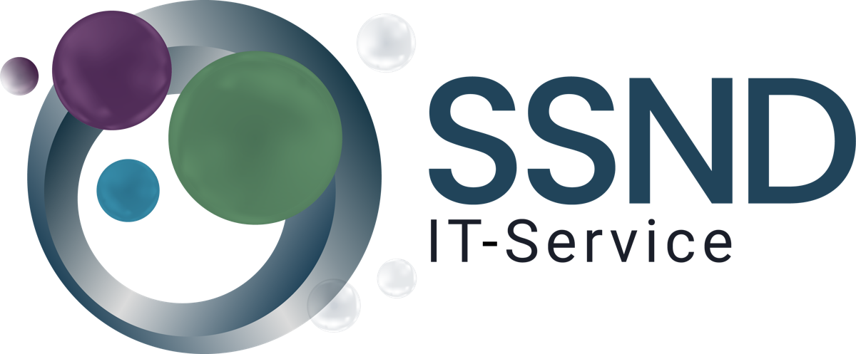
On a light background
On a dark background
The intro animation
The animation tells this story in 15 seconds, before the logo appears.
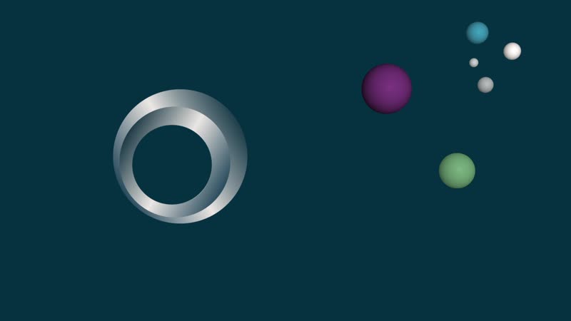
The orbit: SSND world and external systems
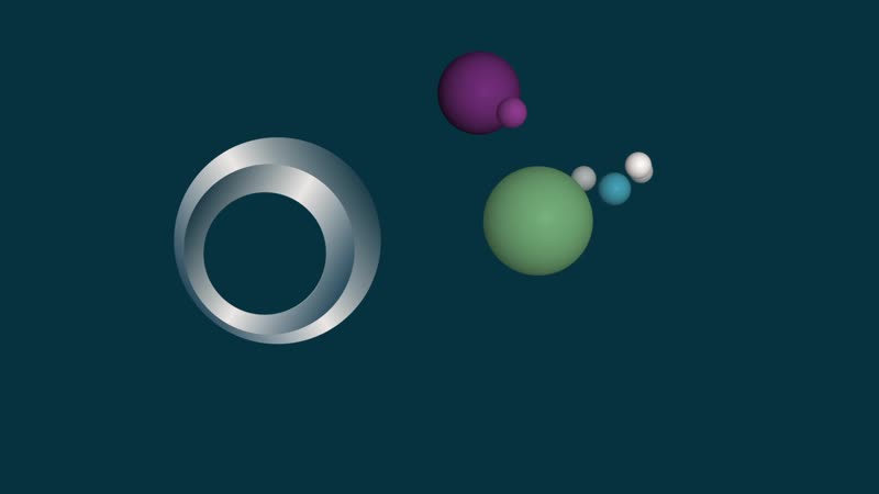
The approach: systems meet SSND
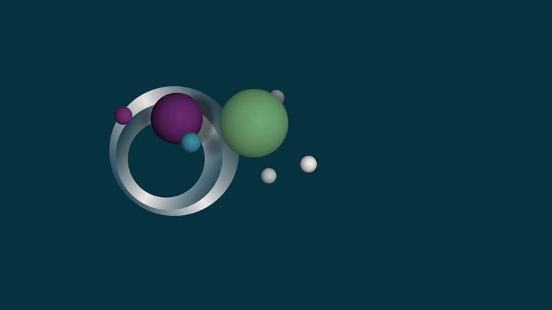
The connection: colour shows the integration
UX optimisation for GibProject
GibProject combines project management and commercial control in one platform. Together with the development team I simplified workflows, navigation and overviews.
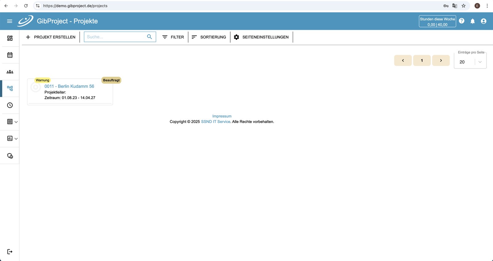
Before: project overview as a simple list
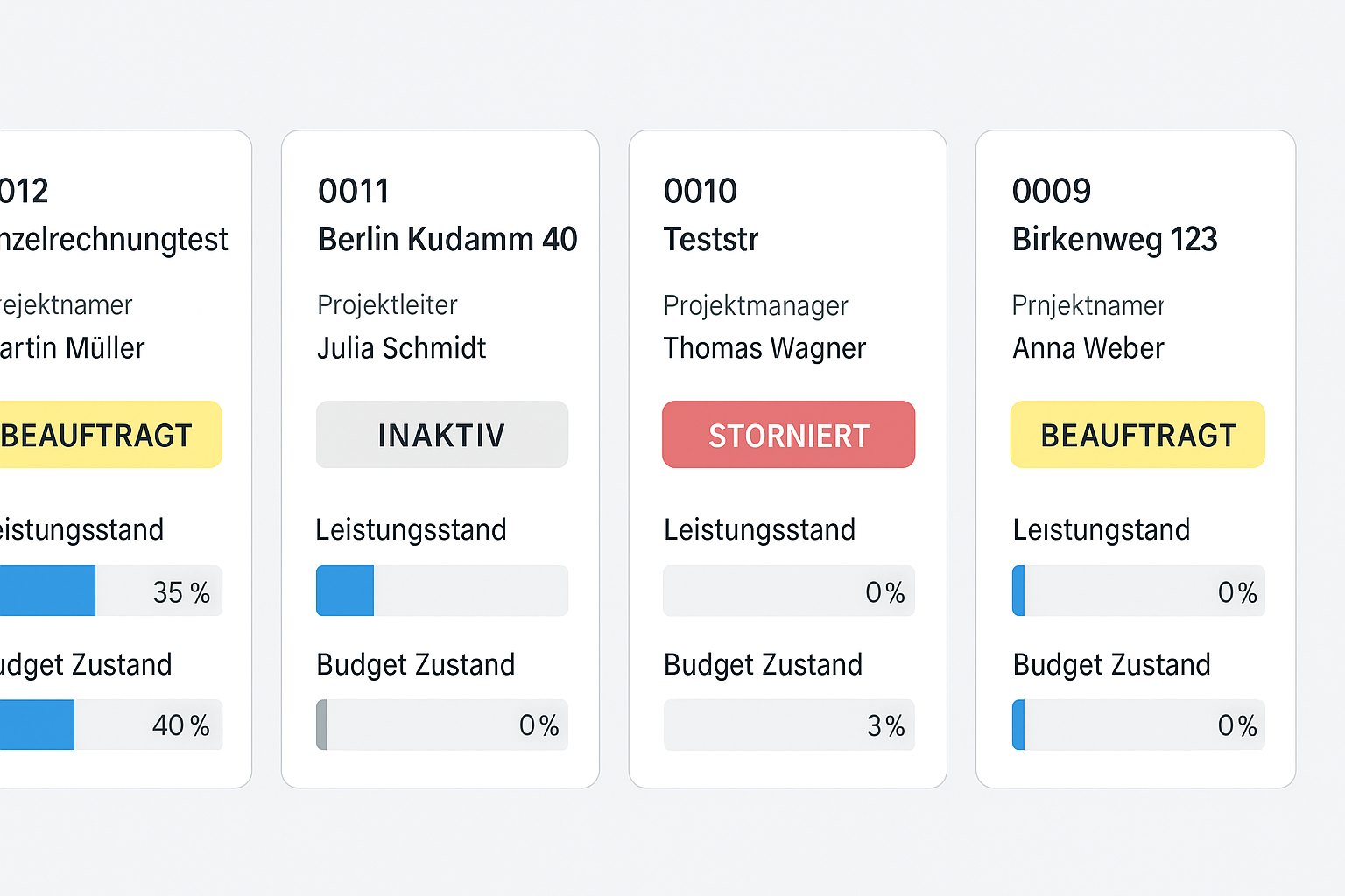
After: tiles with status, progress and budget
Result
Brand, website and software speak the same language. The collaboration continues.
Focus
Logo and corporate design, web design, intro animation, UX optimisation and navigation for GibProject
Use
Website ssnd.de, intro animation and GibProject software
Next project