
Brand development · Corporate design
Spicetech: one brand, one family of products
A new brand identity for a Stuttgart-based software, data and AI company: a logo that tells the story of spices, and five product brands that are clearly recognisable as part of Spicetech.
Client
Spicetech, Stuttgart
Role
Brand strategy, logo, product brands & brand guide
Year
2026
Typefaces
Plus Jakarta Sans, Figtree
The challenge
Spicetech develops custom software and AI solutions and offers five scalable products of its own. Its appearance no longer matched its performance: the products did not read as part of one brand, and a consistent branding was missing. The task was an identity that feels innovative yet reliable, makes the products easy to understand, builds trust with new customers and is instantly recognisable. Clear and structured, with a touch of playfulness, but not too colourful.
The idea
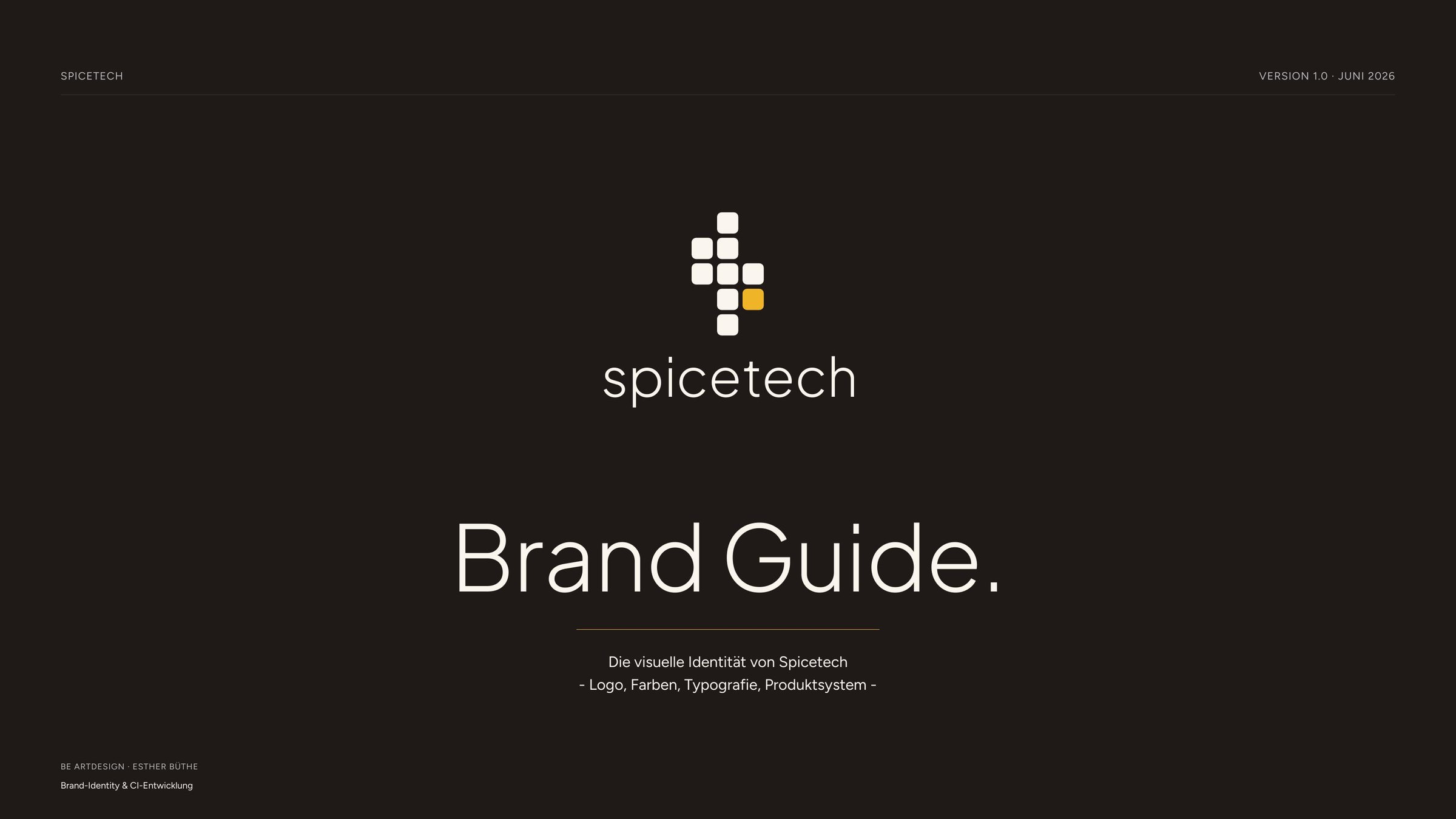
Spices turn ingredients into a dish, software turns data into an edge. That led to the brand idea: Spicetech is the recipe. The logo is a digital spice leaf made of a grid of small cells, one of them in saffron. The products are the ingredients: each carries its own colour in the saffron cell and remains recognisably part of the family. The ingredients may change, the recipe stays.
From complex to simple
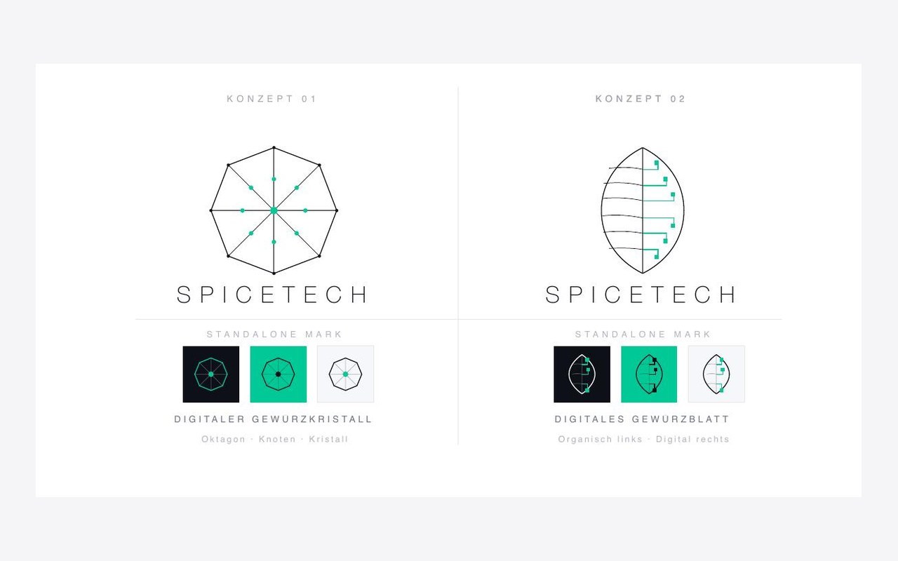
First concepts: crystal and leaf, rich in detail
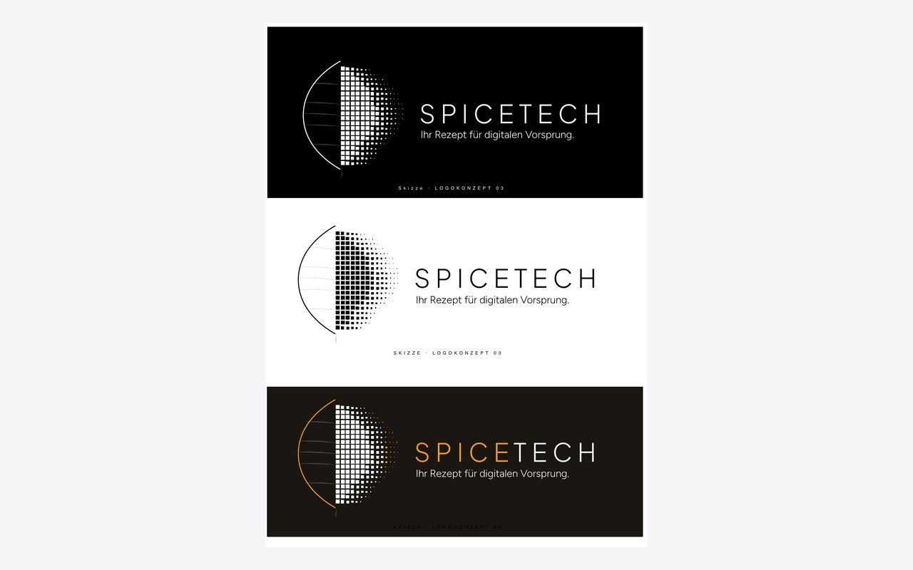
Sketch: the reduction begins
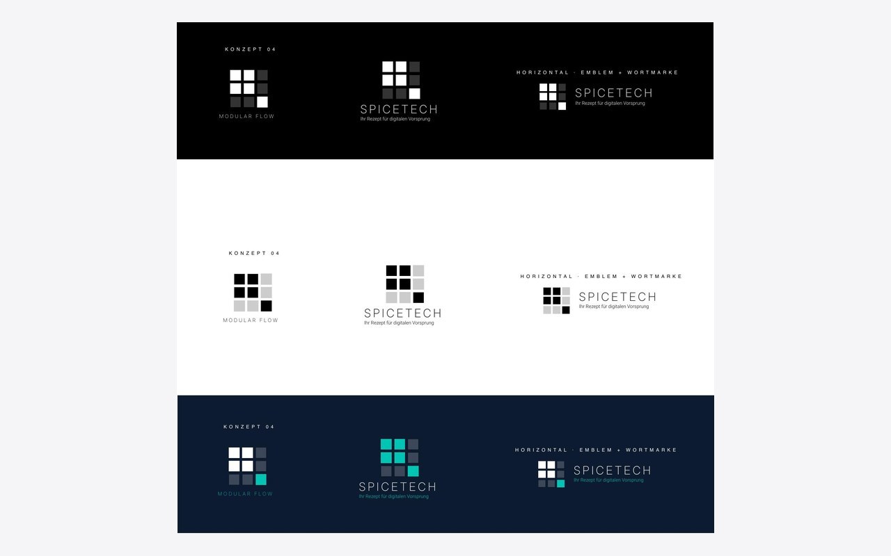
Concept: simple and scalable
The workshop
In one day in Stuttgart I showed the possibilities and made the external perception tangible, through typography and design in variants. Together we made the selection: how should Spicetech be perceived? I designed and moderated the workshop, with structured exercises instead of debates about taste.
Showing the effect
Logo concepts, colour schemes and type pairings in variants, each in light and dark.
Clarifying perception
Choosing adjectives, first impression, positioning matrix: how do we want to be seen?
Setting the foundation
Logo direction, colour world, typeface and product logo principle were recorded as binding.
Approach & process
01
Ideas & sketches
First logo concepts and sketches grow out of the world of spices as the basis for the decision.
02
Workshop in Stuttgart
One day to show the effect and external perception, to select, and to set the foundation.
03
Development
Logo, colour world with espresso, saffron and cream, typography with Plus Jakarta Sans and Figtree, all rules in the brand guide.
04
Product family
All products share the shape of the main logo, only the saffron cell changes colour. The system is scalable: products can be replaced or added, one new colour is enough.
The brand in detail
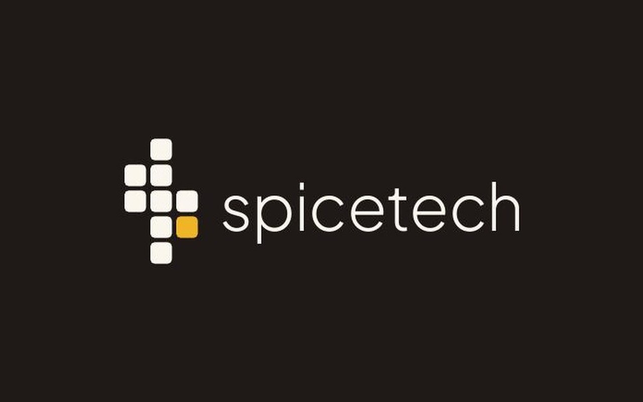
Logo: spice leaf and wordmark

Colours: espresso, saffron, cream
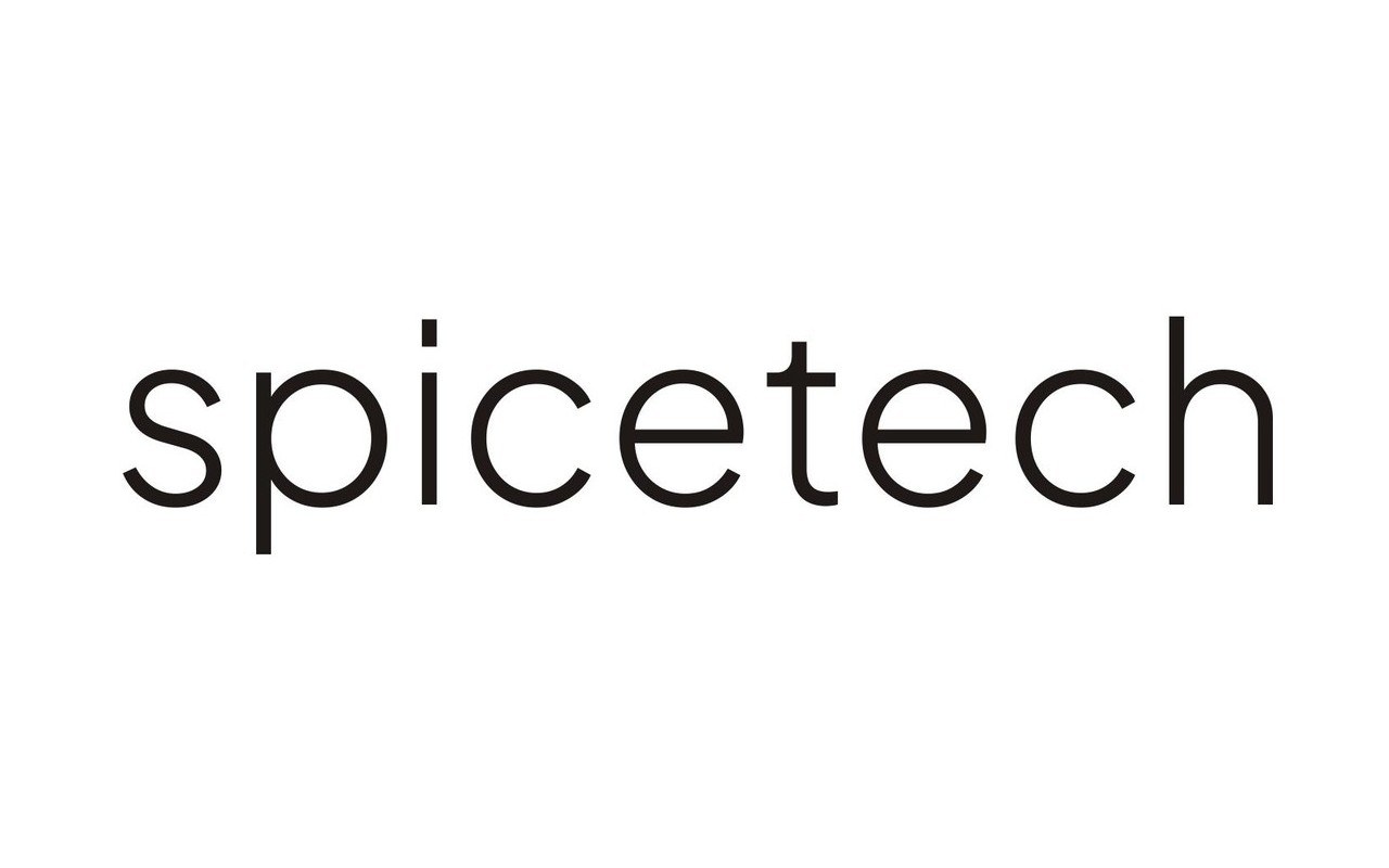
Typeface: Plus Jakarta Sans
Five product brands
Geolicy, Predecy, Valicy, Alignicy and Genericy are the five current products: one emblem, five colours. The product colour identifies the product, the shape ties it to Spicetech. The system is built to grow: products can change or be added without redesigning the brand.

Result
The brand now appears consistent and recognisable, from the website to the product pages.
Focus
Logo system, scalable product family, typography and usage rules
Use
Website spicetech.de and product pages
Next project